
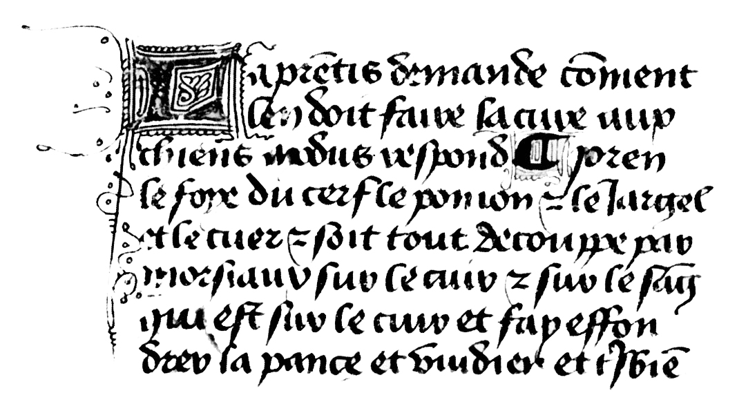
Initial Process
Calligraphy has been a passion of mines for over a decade now. When given the task of designing a typeface there was no hesitation, I wanted to do an extravagant gothic blackletter style typeface. Choosing what kind of blackletter was an even quicker process as my favorite for has always been a french style called Batarde or Bastard. The way that the majescules are so large and ornate always caught my eye when compared to textura and schwabacher capitals.
Early Sketch
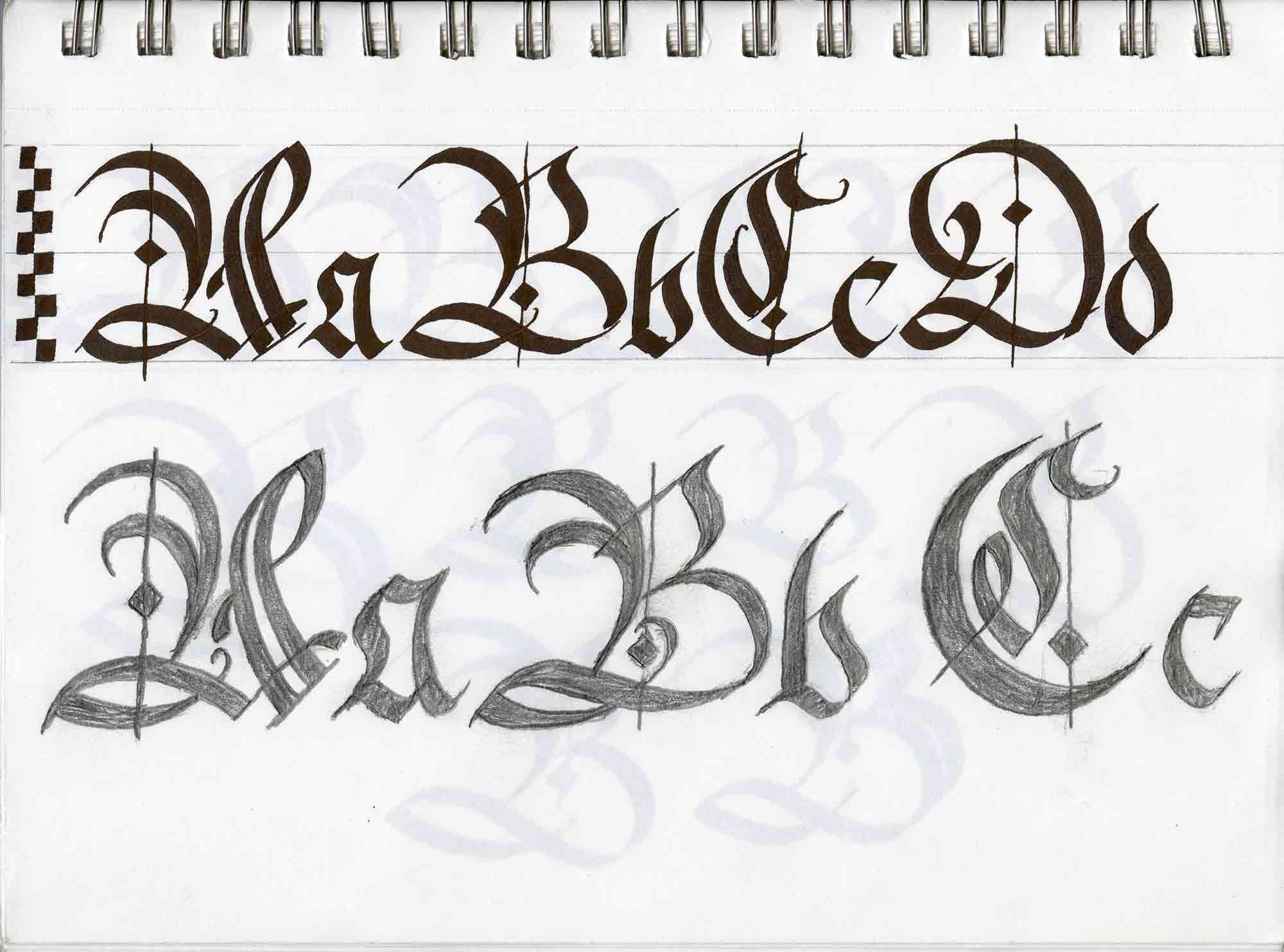
I started off by using some calligraphic iterations of the letterforms I wanted to base my typeface off of using a broad tip calligraphy pen.
I then tried hand lettering for the first time and tried to mimic the calligraphy iteration so I could make refinements without using an ink pen.
Slight Variations
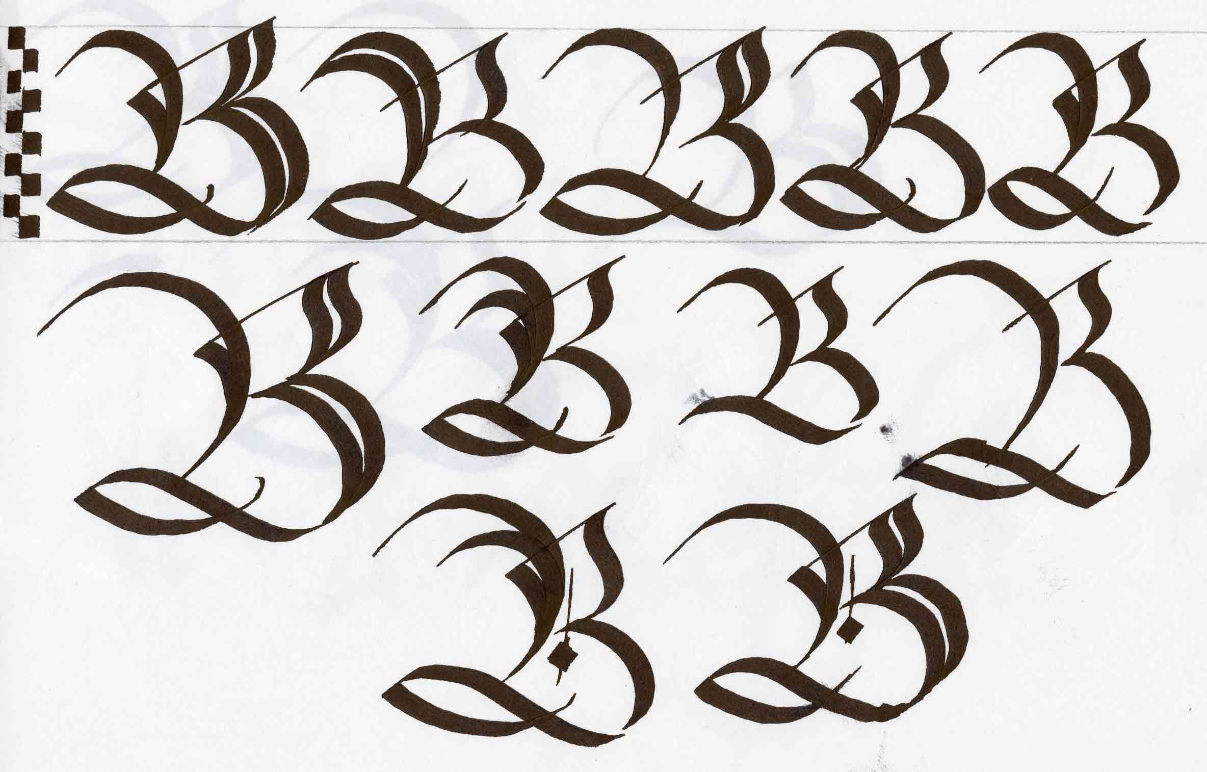
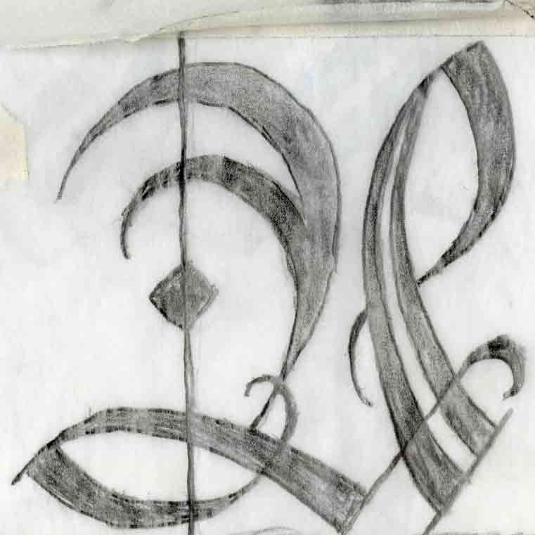
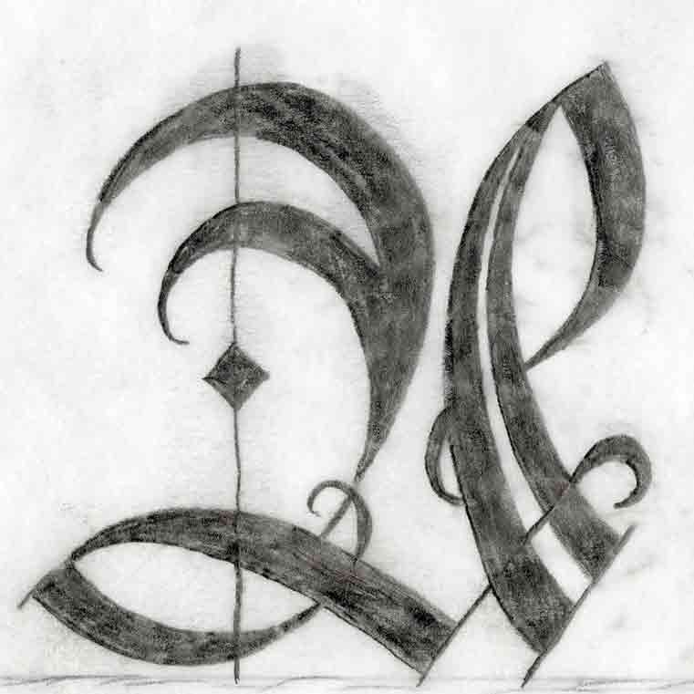
I decided on the batarde letterforms I wanted to use to inform the rest of the majescules but I realize that I was not very consistent in my writing. I decided to draw the letter B several different ways as it has many of the basic strokes that are used across most of the letterforms in the alphabet. I made changes to the main supporting structure of the letterforms by doubling them up and adding embellishments.
Graphite Iteration 1
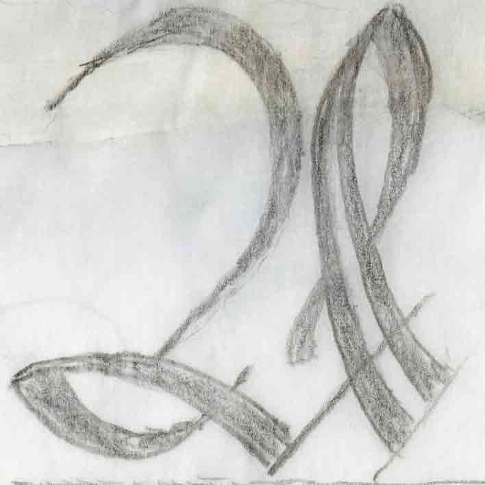
For my first iteration I decided to completely freehand letter the majescule A in order to step away from my attachmetns to calligraphic ways of making the letter. I decided to do the most basic strokes so I could refine those and let the embellishments come out in future iterations.
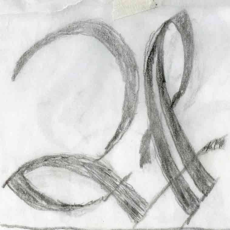
Graphite Iteration 2
For my first iteration I decided to completely freehand letter the majescule A in order to step away from my attachmetns to calligraphic ways of making the letter. I decided to do the most basic strokes so I could refine those and let the embellishments come out in future iterations.
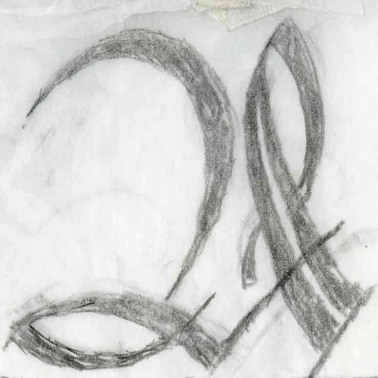
Graphite Iteration 3
For my third iteration I tried to angle the double stroke on the right in more to better accentruate the negative space in the middle of the letterform.
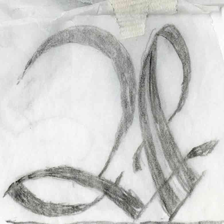
Graphite Iteration 4
This iteration I focused on balancing out the weight of the strokes and making sure the left foot was the right curvature and not too flat.
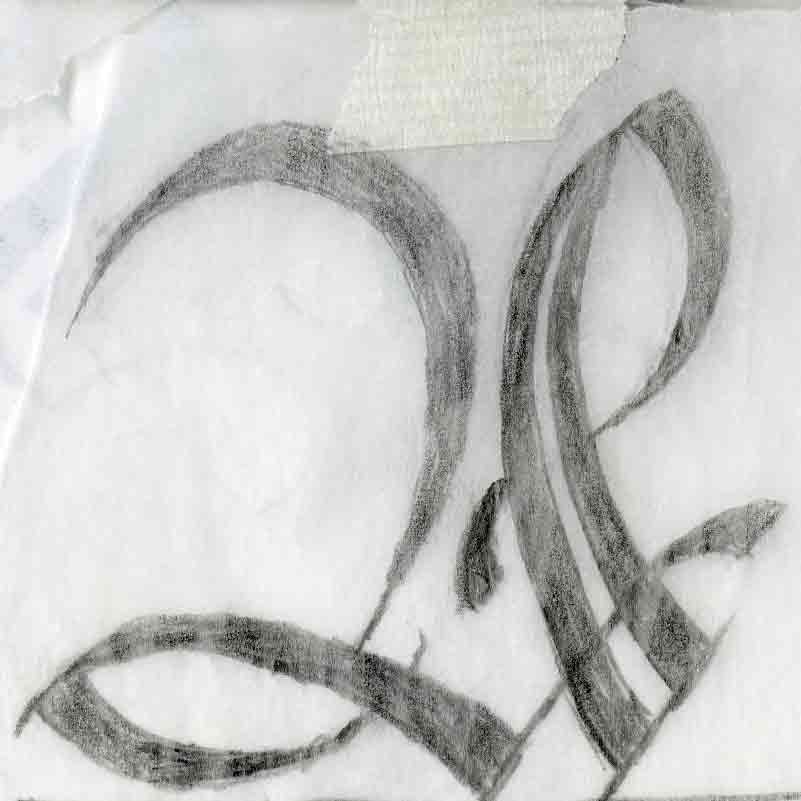
Graphite Iteration 5
In this iteration I rounded out the right stroke more and had the embellishment on the end curve inwards more with a foot to end the curve inside the letters negative space. I aso tried to define the end of the upward stroke of the bottom stroke of the letter and make it end more angularly.
Graphite Iteration 6
For my final trace iteration I added all the embellishments that I could to this iteration. I extended out the ends of the strokes to curve more and wrap itself around the main strokes.
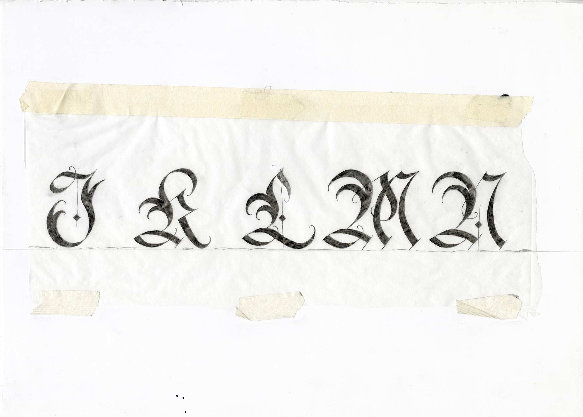
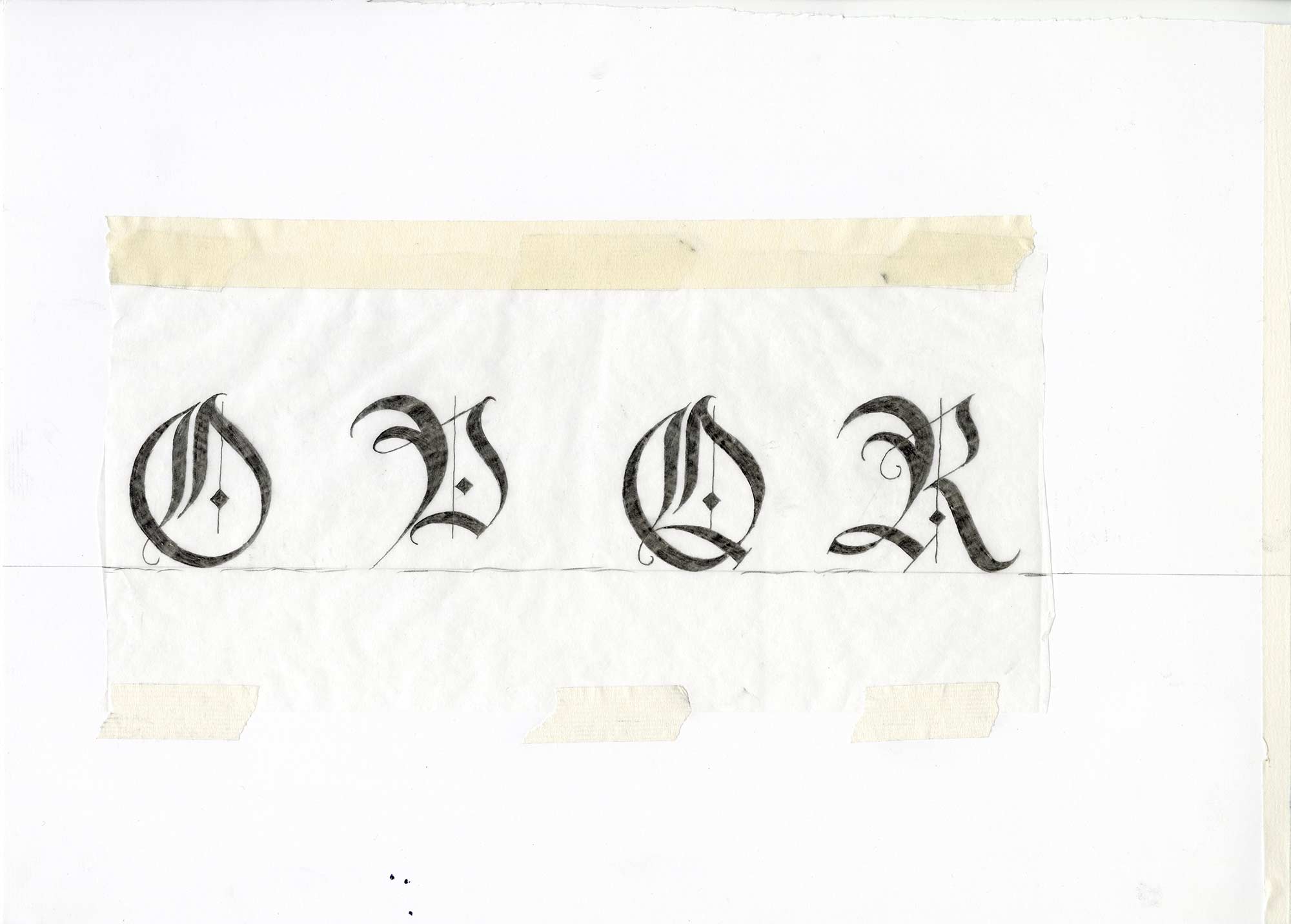
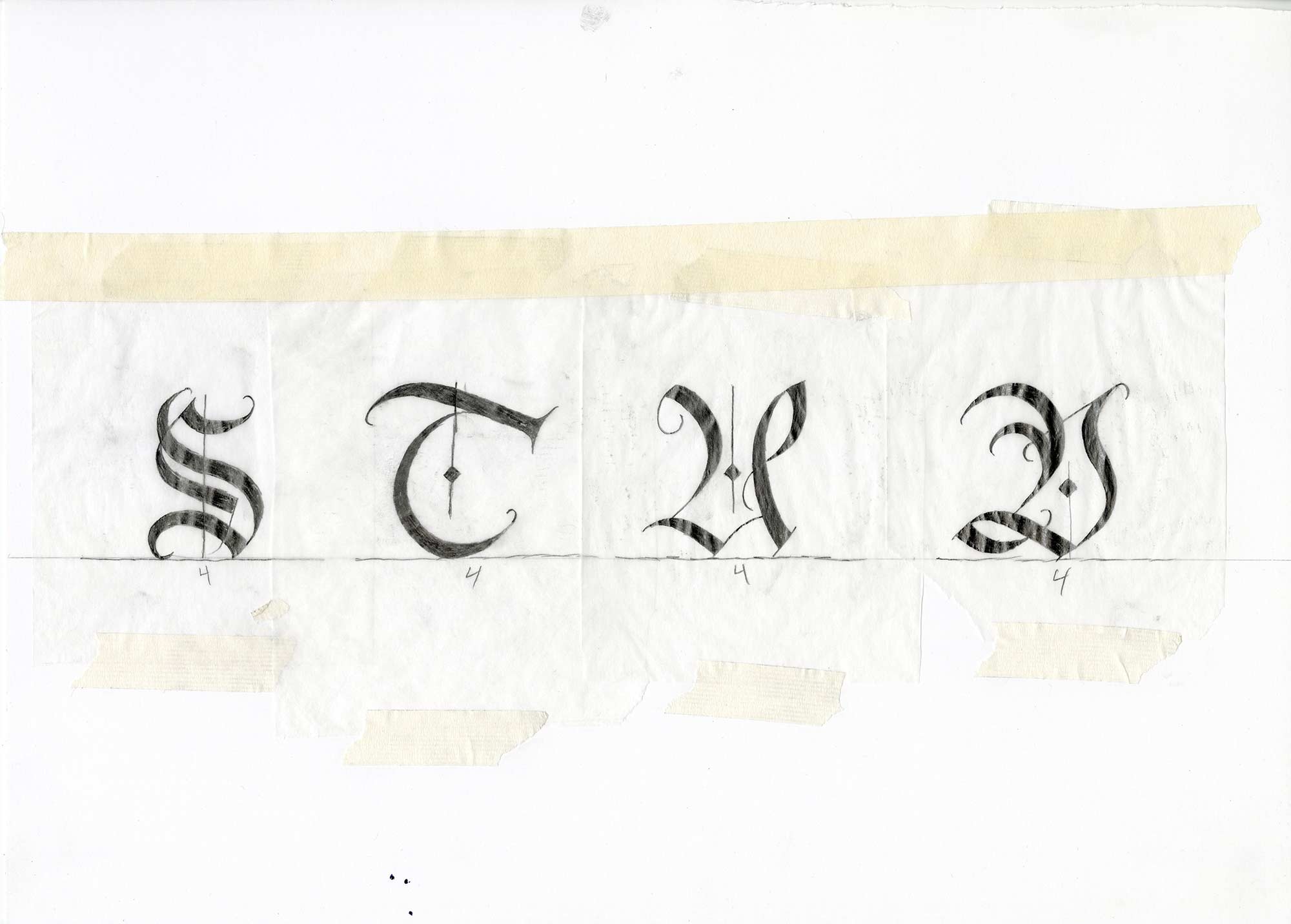
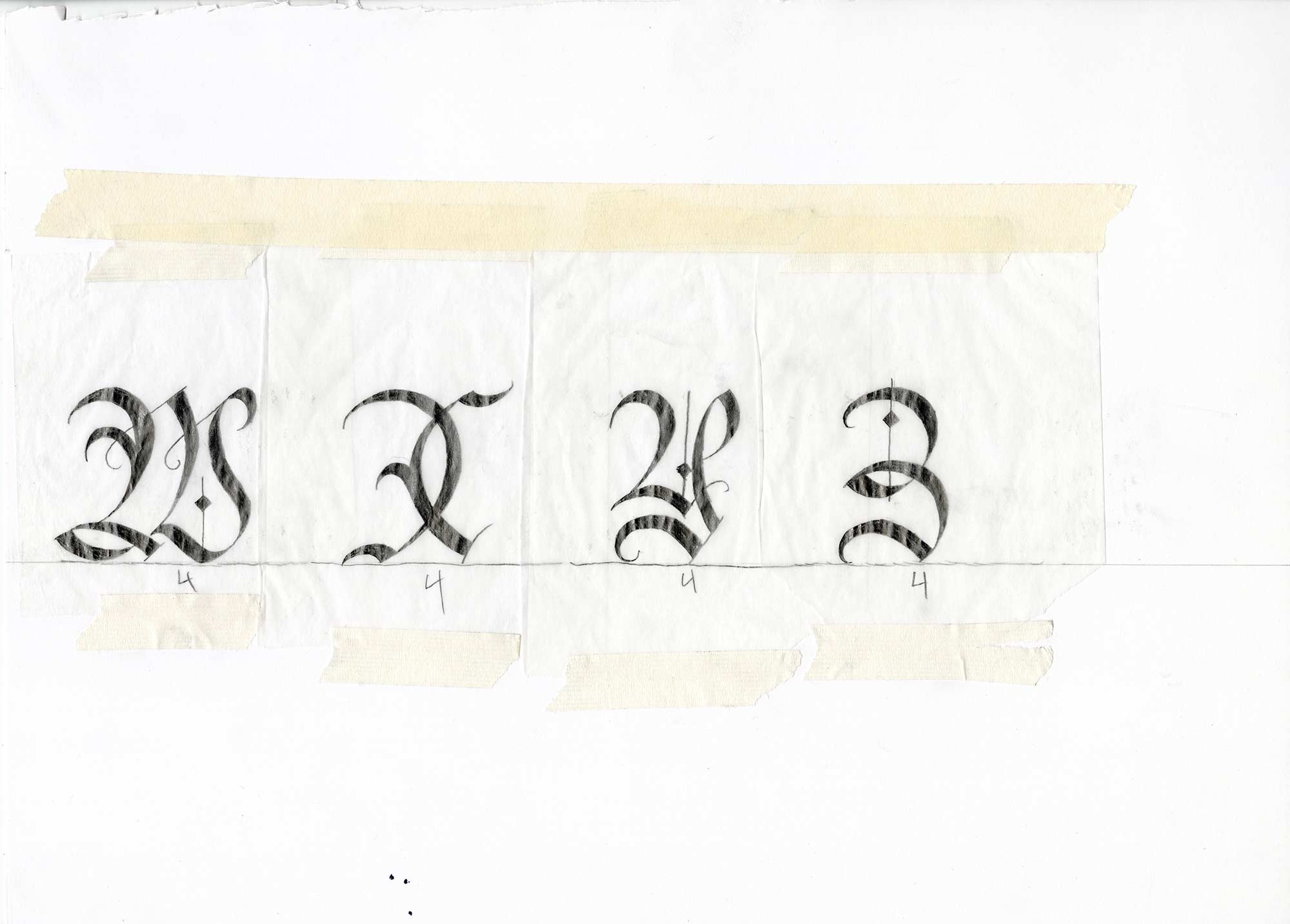
Final Iterations
For my final iteration I really focused on making the graphite sketch as defined as possible and going over the thinnest parts only once to get as high a contrast between thick and thin parts of the letterforms.
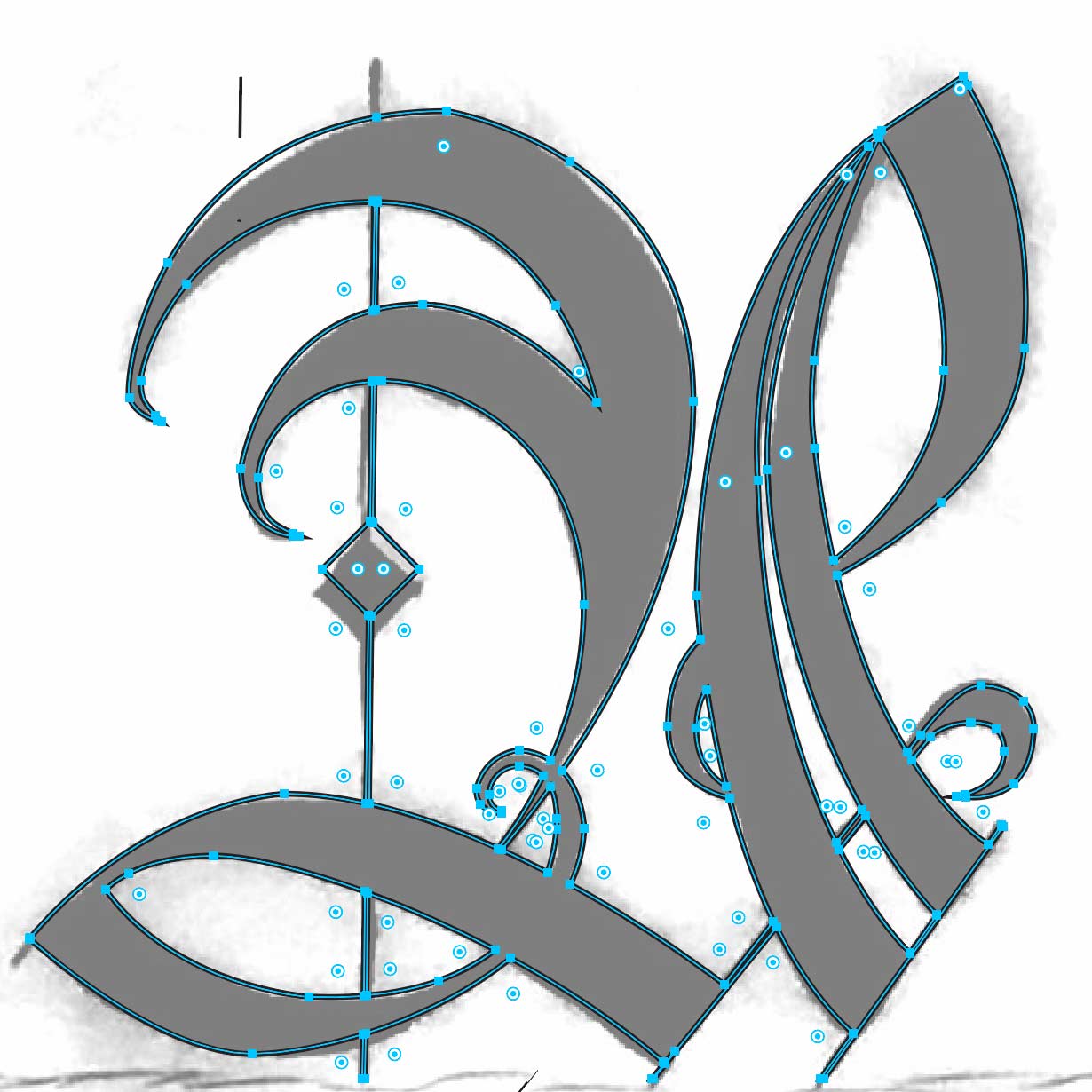
Vector Iteration
To get my hand rendered sketches into the digital space, I needed to scan them to create high quality images. With the images I used them to trace using the pen tool in illustrator to create vectors that I could scale to any size I wanted.
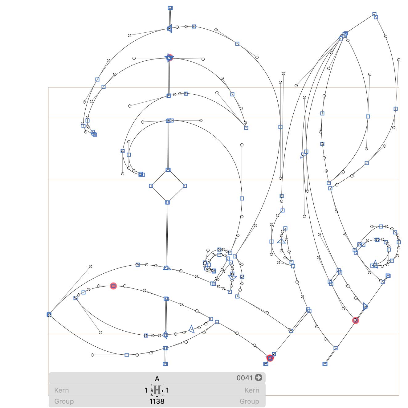
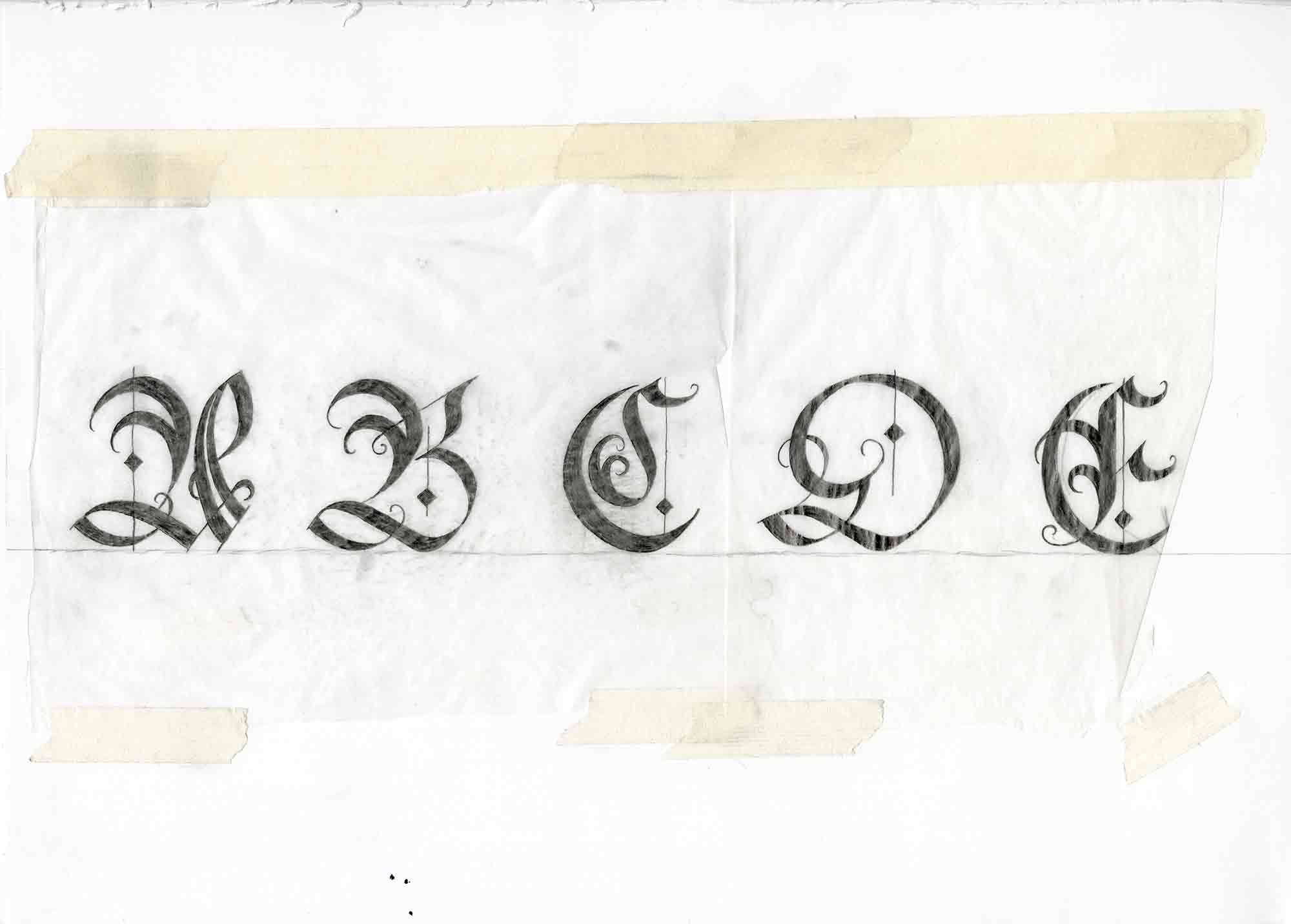
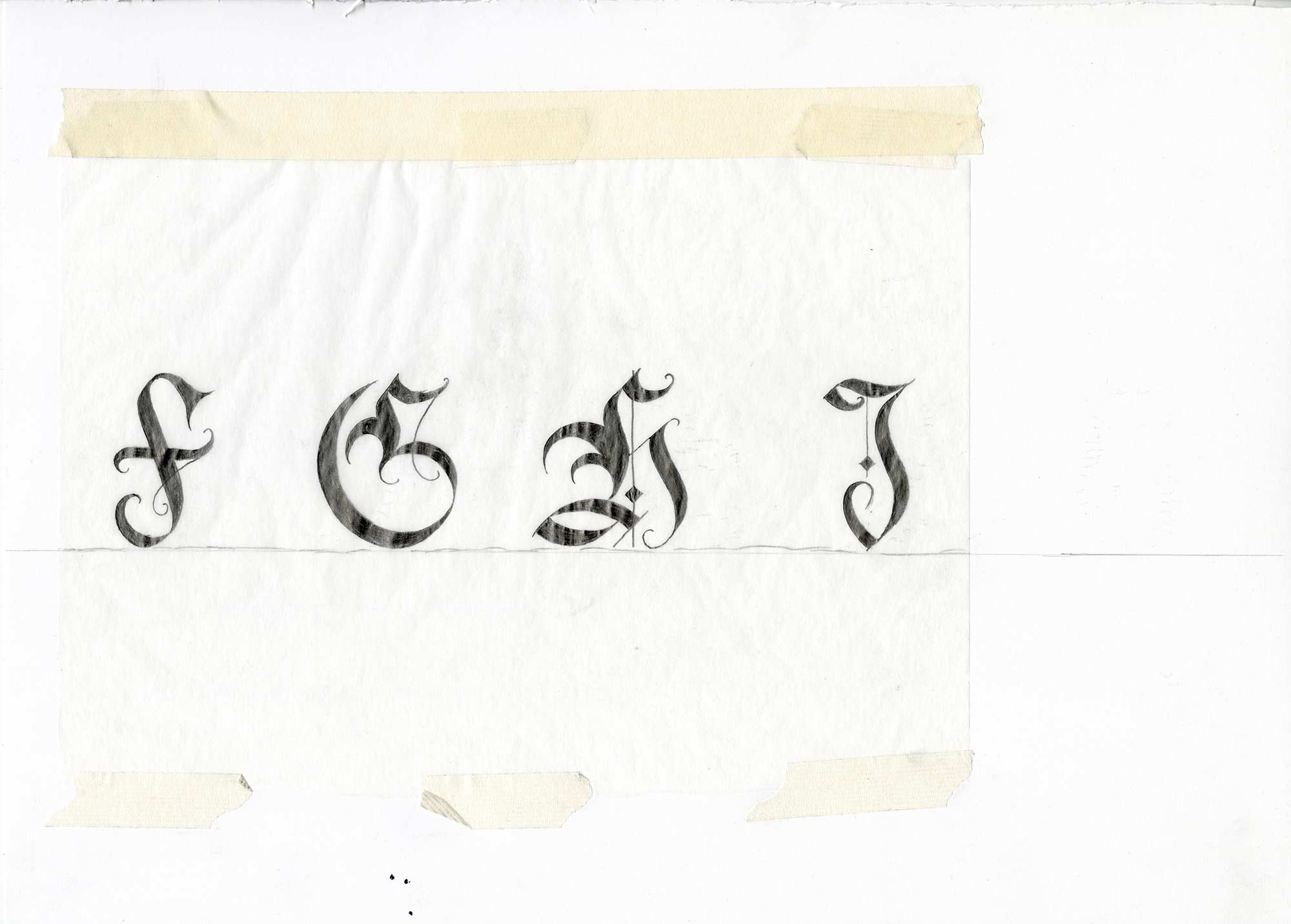
Creating the Working Typeface
After creating vectors for all the characters in illustrator it was time for the final step. I used the vectors in the glyphs app to create a working TTF that can actually be used on my machine. I made sure all the letters had the same baselines and were sized properly. Using the application helped me kern my characters to turn it into the fully functioning version.