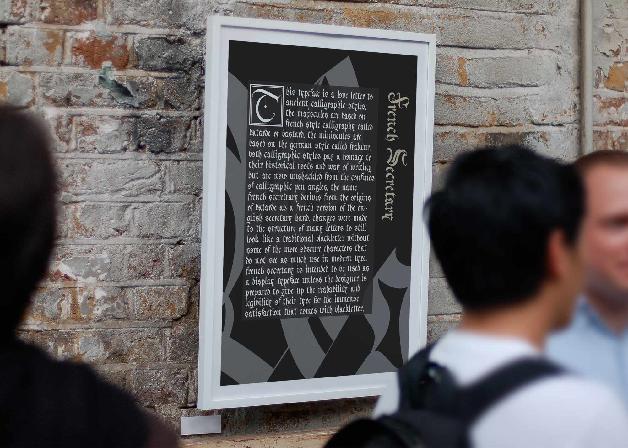
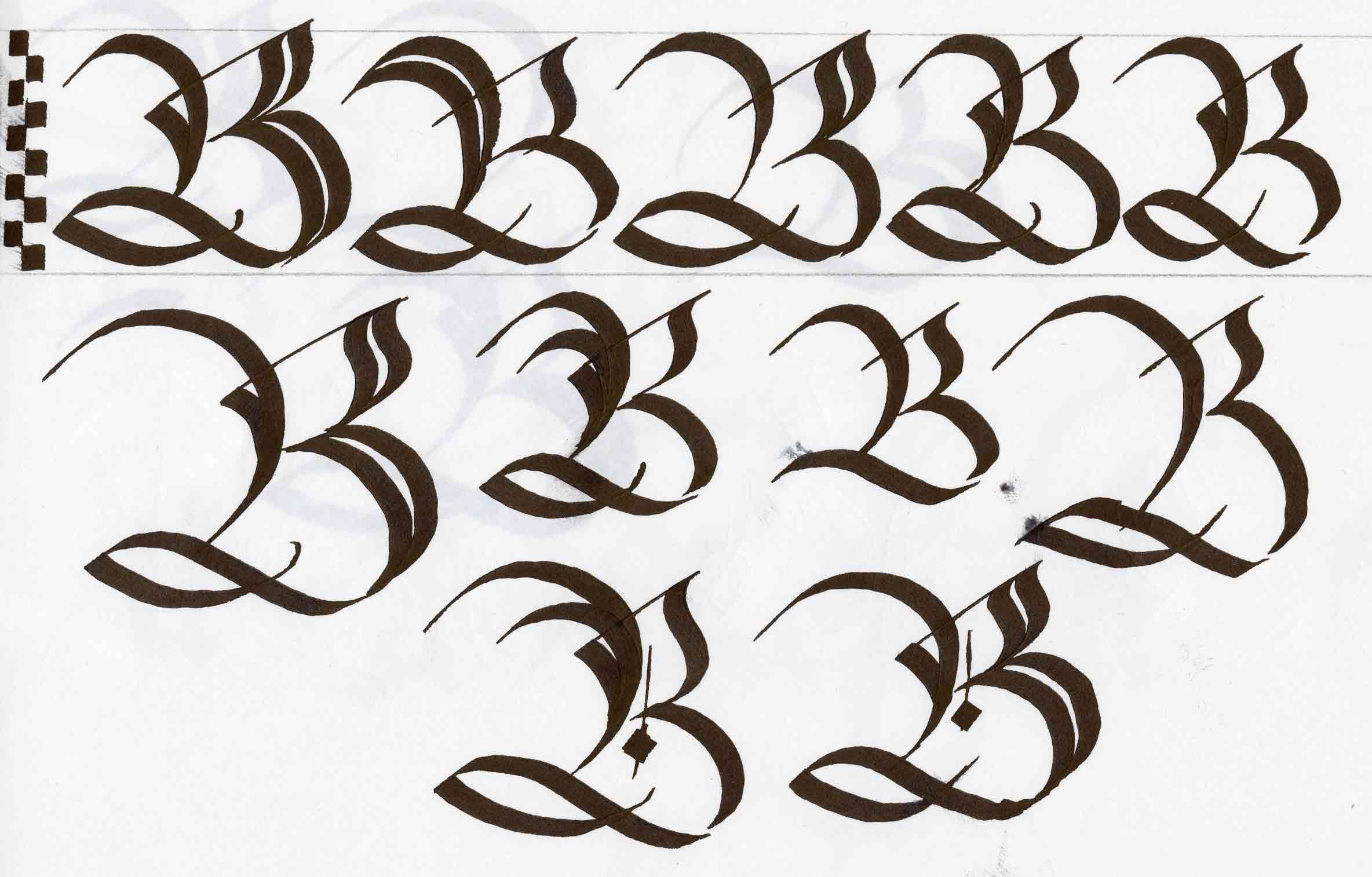
I was given the task of designing my own typeface. Without hesitation I decided that I wanted to do my own take on blackletter. I have been practicing calligraphy for a decade now, and my favorite hands to learn were always the different variations of blackletter. My overall favorite style of Calligraphy was Batarde, an ornate form of the English secretary hand used by the French. I decided to name my typeface French secretary after the historical origins of Batarde.
Majuscule Process
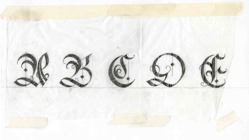
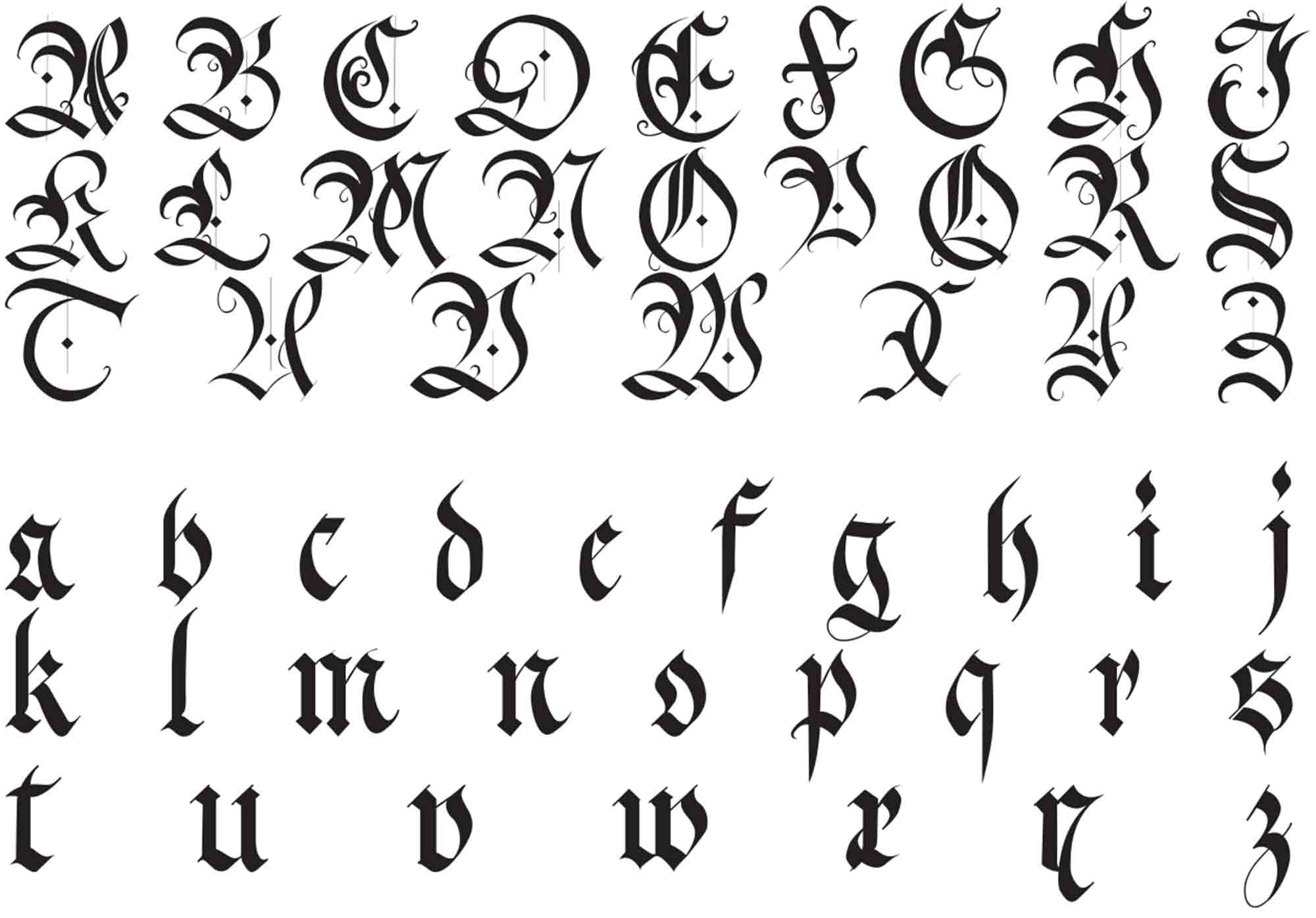
I started my process by using a fountain pen to create the first iteration of my capital letters. Tracing the calligraphed forms was freeing as I was not limited to curves informed by the flat angle of my nib but rather what I felt was best for the balance of the letterform.
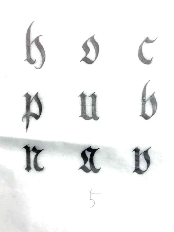
Minuscule Process
To compliment the Batarde capitals I had created I decided not to use the batarde miniscule as I did not care for how round and thin the letterforms contrasted with the Majescule. I always avoided the miniscules in favor of other blackletter variations such as Fraktur and Schwabacher. Fraktur is one of the few calligraphic styles with letterforms that I do not feel like changing, so I only modified a few characters.
Typeface Full Set
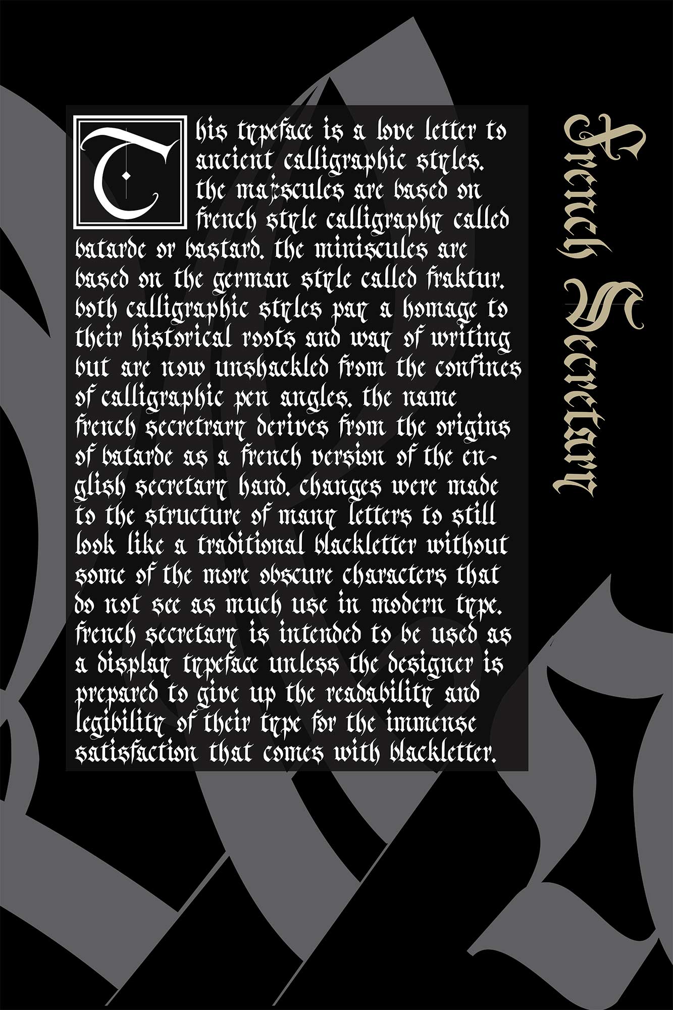
Promo Poster
Creating the poster to accompany the typeface I wanted to call upon the roots of blackletter and place it within a historical context but with a more contemporary take. The most beautiful bodies of text that I can think of start with a large drop cap and adhere to the Gutenberg grid. I felt that a black background to the white text was too boring, so I added a capital A and lowercase a in the background with an opacity.