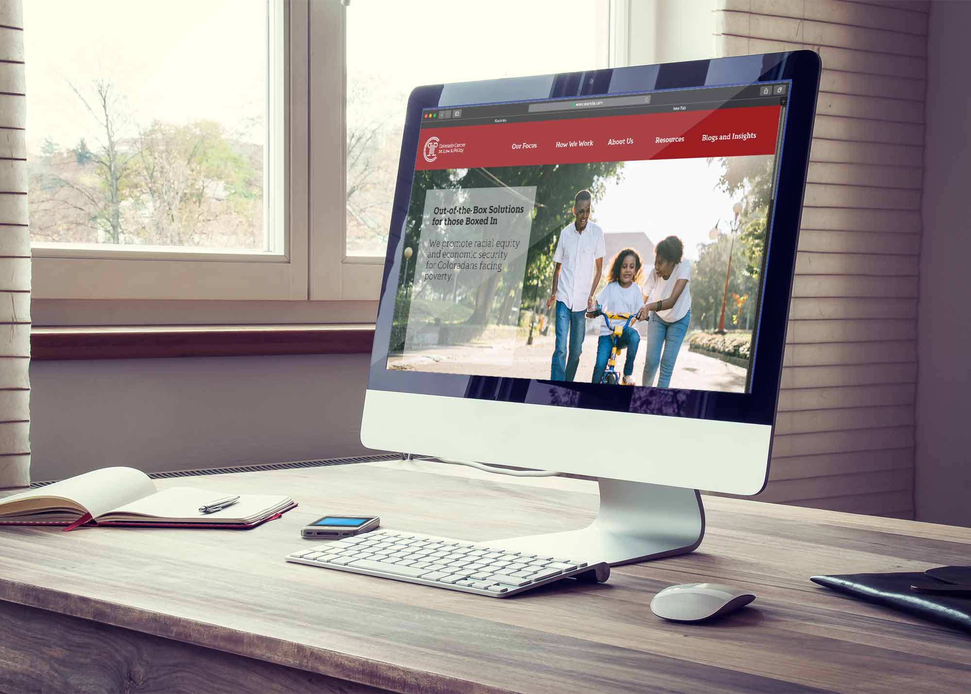
I was placed on a team with Kailee Bye and Kendra Spangler to create an identity system for a client chosen by our professor. The client was the Colorado Center on Law & Policy, an organization that advocates for underprivileged and marginalized groups. They lobby for change in the legal system to better benefit these groups of people. Our goals were to write a new Mission Statement and supporting written content, create a logo and accompanying brand standards, and collateral materials.
The Colorado Center on Law and Policy serves
under-represented communities affected by poverty erasing barriers, through research, advocacy, and legal strategies.
Core Values:
Equity: Improving equity in communities where systemic barriers persist by advancing policy that honors inclusivity.
Integrity: Transparency is integral to building trust within the people we serve; our work is unbiased, grounded in fact, and driven by our mission to end poverty.
Strategic Action: We implement quantitative and qualitative research to design and measure solutions, bringing power and advocacy to low-income Coloradans
Collaboration: In order to get results we must communicate and work as a team. Impoverished and discriminated people know their condition and we must honor their ideas and priorities in order to help them access their political power.
Vision:
Through legal discourse we seek to reform the system in order to create equal opportunities for all.
Objectives:
– Increase access to healthcare and education
– Lower rates of homelessness and hunger
– Eliminate racial inequities
Equity Statement:
CCLP advances laws and policies in order to demolish ongoing discrimination, oppression, and unfair economic advantages throughout the community of Colorado.
Brandmark Iterations


Through my sketch process I played with the idea of using their chosen abbreviation of CCLP and using it in letterforms and pictorials. The idea I found the most interesting, was using the L and P to create a pictorial of a Greek column to represent the law system. The C’s could go around the column to represent an enclosure or a protection as a reference to their intent to protect underprivileged groups.

Color Process
My teammate Kendra Spangler performed color studies on the brandmark and determined that the best course of action would be red as call to action and the addition of an earthy tone to make it more subtle and less aggressive.
Type Treatment
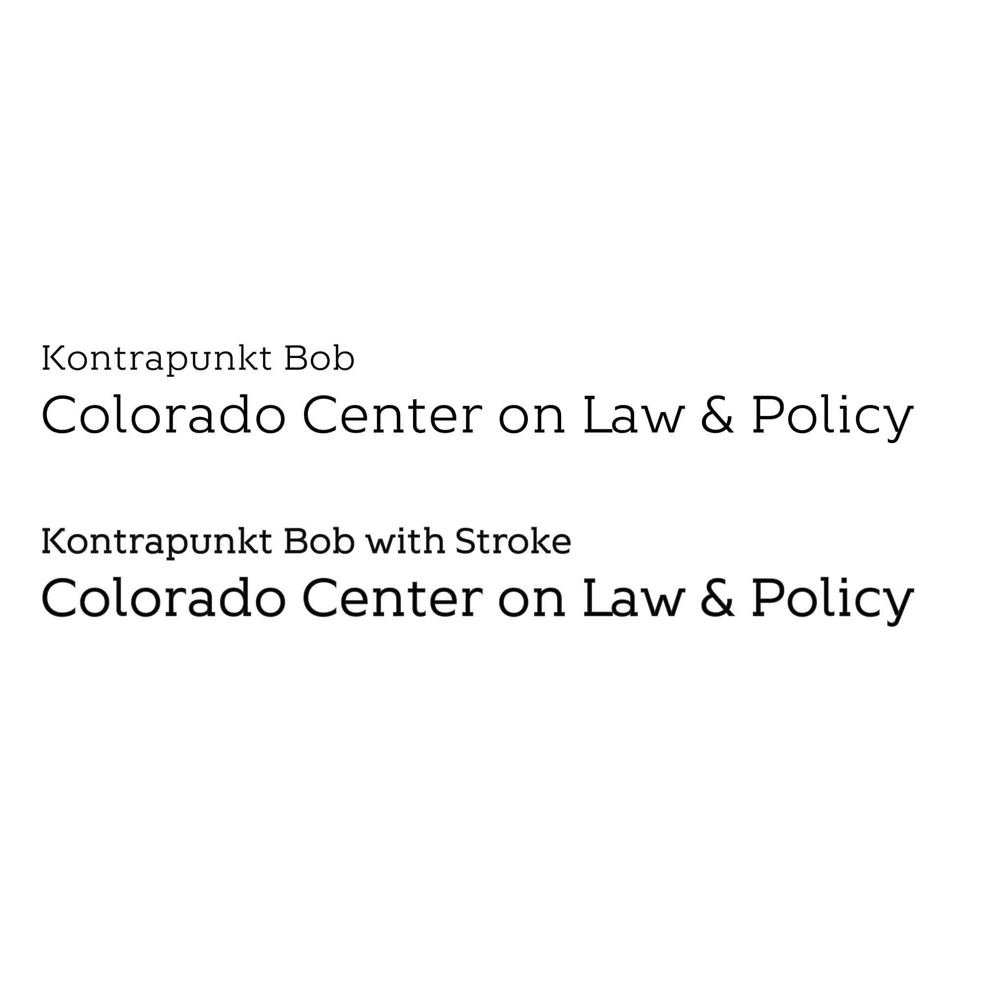
Kailee Bye researched type choices to compliment the brandmark and the emblem. They found that the weight of the type and the capital C paired well and experimented with the typeface Kontrapunkt as it had slab serifs similar to the form of the column that I created.
Final Lockup


Web Actualization