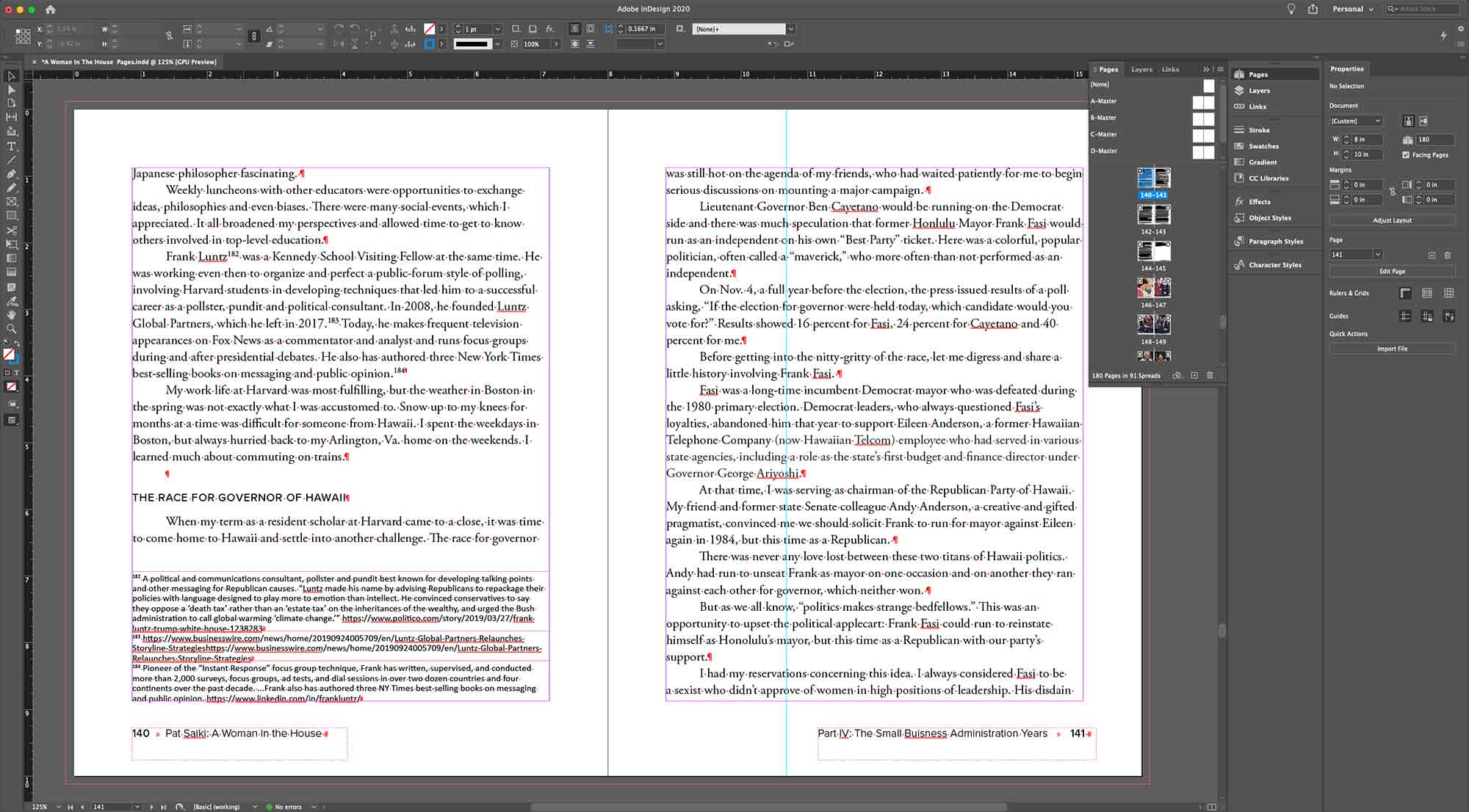
This project is my first freelance job where I used Indesign outside of an academic setting. Floyd Takeuchi contacted me to take their Word document and get it formatted for print. Throughout the course of this project I learned a lot about how to more efficiently use Indesign and getting the hang of formatting options and flowing text features. One of the hardest decisions was on the proper margins for the books and ended up calculating 5 different page to text ratios before deciding upon the final product.
Type Choice
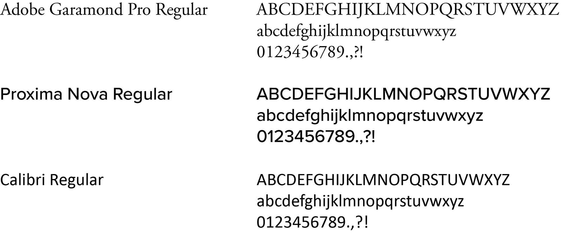
Deciding on the type I would be utilizing in this memoir required me to do some research into what was popular during the height of Patricia Saiki’s political career. I decided to go with the font Garamond as it was popular during this time and that the type gives the text a historical essence that reflected the historicity of this woman’s life. To pair with Garamond, I chose Proxima Nova as the wider modern sans serif contrasted with the historical sans serif that referenced the past while anchoring it into the present and reflecting the modern build of the book itself. Calibri was chosen for the footnotes as it worked well with the size and sheer amount of notes to be packed onto the page.