
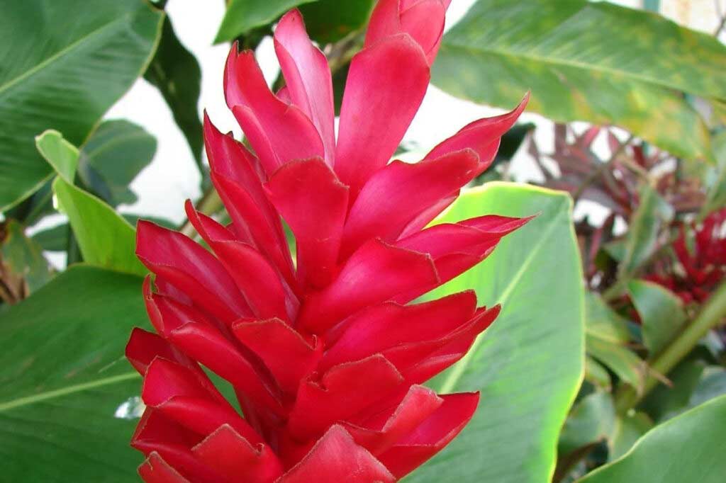
Out of all the brand marks I submitted to the Logo Lounge 12 contest, I never expected that they would choose my personal identity mark with my full name lock up. My personal identity mark is an abstracted representation of a red ginger flower with my initials. I wanted something that referenced my local Hawaii roots while also being warm and ambiguous enough that I could use it in an array of contexts. In many of my personal projects, I take a lot of inspiration from plants. I chose red ginger because of comments from family and friends describing me as intimidating but sweet on the inside.
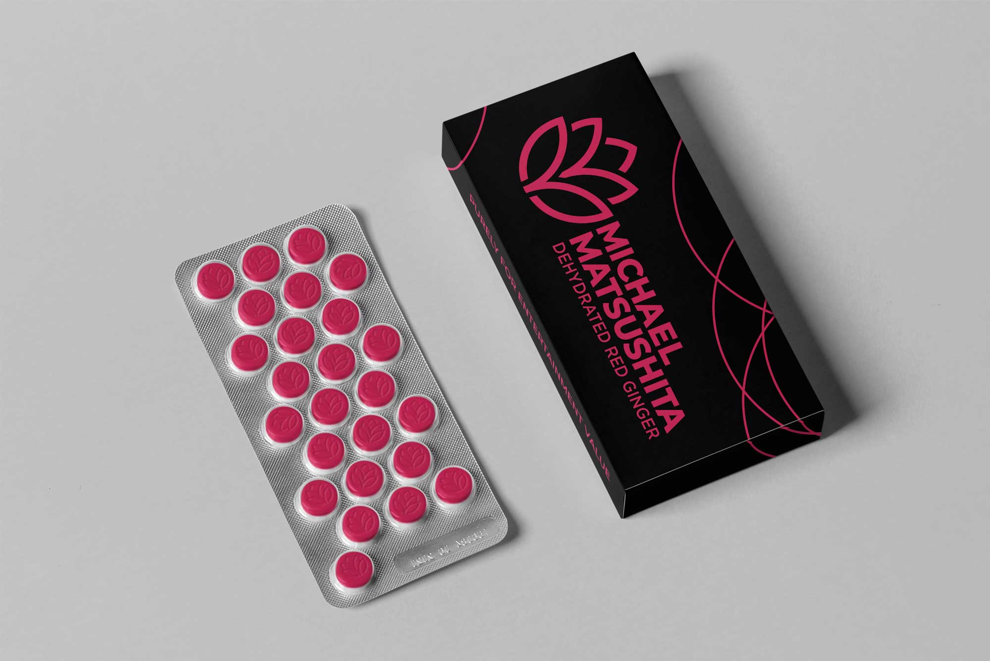
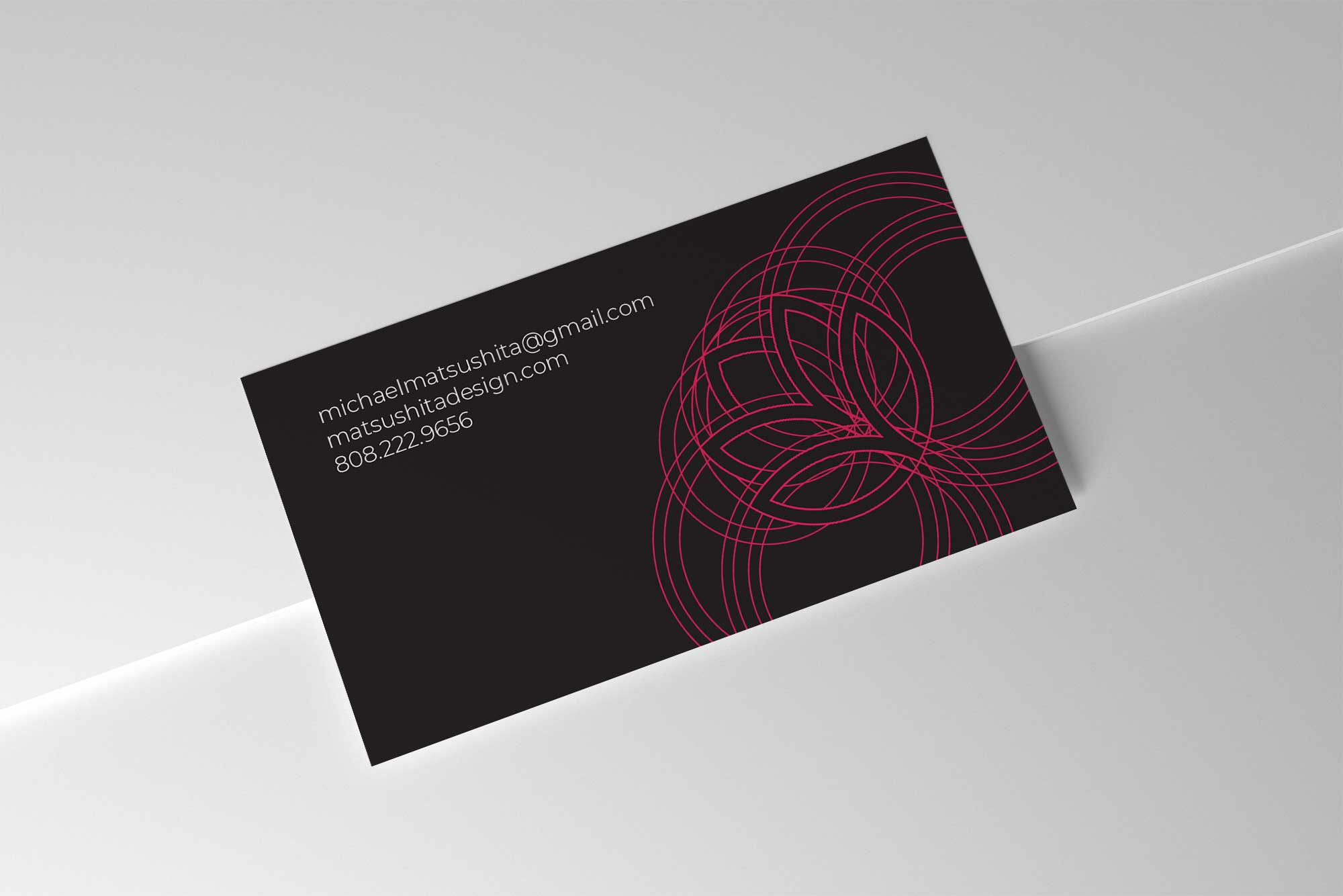
Deciding on a personal identity mark is an odd challenge that at first felt like a narcissistic act. Looking back, this was a necessity that I did not know that I needed. Today, I use this on my business cards, invoices, this website, on my car, and I even mock up things with my identity mark on it for fun. The strangest thing I’ve mocked up for my own entertainment is a blister pack of pills.
Process
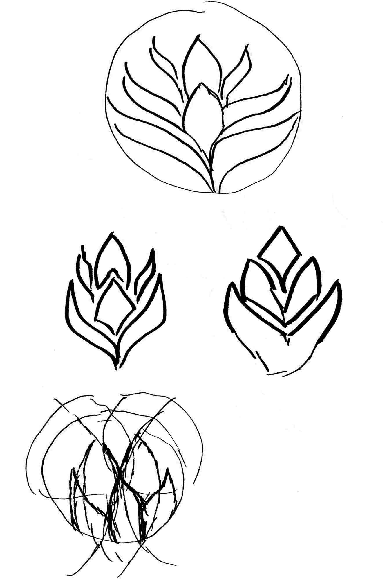
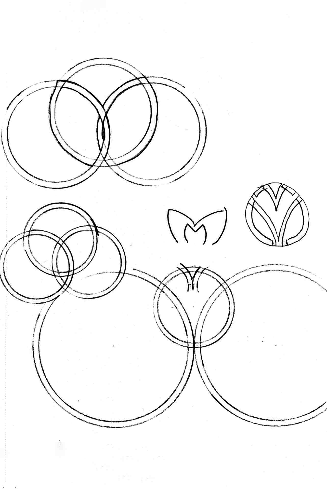
I initially started with simplified geometrical representations of the flower itself. Later I realized that I could push the shape of the M’s to form the sharp petals of the flower. I utilized the same process of creating my brand mark that I use for my personal passion project of creating Japanese Crests or Mon using the perfect curvature of circles.

Color and Type choice
The color chosen for the identity mark was a shade of red pink that I pulled off of a photo of the red ginger flower. I played with the color and brought in more magenta and darkened it to function better on a white background and stand out on black.
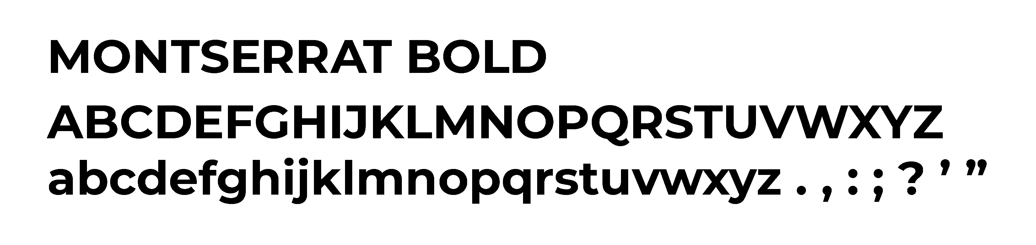
While researching typefaces I found that Montserrat matched well with the round and sharp cornered identity mark.
Final Lockup

Logo Lounge Contest
I entered the Logo Lounge contest in May 2020 and submitted over 2o of my brand marks from both academic projects and my personal work. The judges for the contest picked my identity mark to be showcased in their 12th bi-annual book.